Whatever you call it, it’s home

Why we’re not celebrating Tuponia’s 150th
Why we’re not celebrating Tuponia’s 150th
The Canada brand is one of the most recognized national brands around the world, partly due to its reputation for natural beauty, partly due to its inspired deployment of its wordmark and other marketing techniques.
A 2015 ranking of the top national brands put Canada at fifth overall, just behind Japan, Switzerland, Germany and Sweden—not bad company to keep! In addition to the visual identity, Canada scored high marks from international travellers for its reputation as a tourist destination, high standard of living, natural beauty and public safety.
As we mark the 150th anniversary of Confederation, let’s take a look at how the branding of “Canada” has changed over time.
c. 15,000 BCE to Present
For the original inhabitants of what is today called Canada, this sprawling landmass went by dozens of different names. In more recent times, “Turtle Island” has become a common name used among Indigenous peoples to describe the territory bound by the Arctic, Atlantic and Pacific oceans.
1535
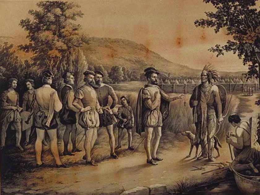
French explorer Jacques Cartier appropriates the Huron-Iroquois word “kanata,” meaning “village,” to describe the region around modern-day Québec City, but slips up and spells it “Canada.” You’ve probably seen the Heritage Minute.
1791
The first “official” use of the name “Canada” comes into effect when Québec gets split up into the colonies of Upper Canada and Lower Canada.
1865
Two years before Confederation, no one had settled on a name yet for what to call what was then “British North America.” Politician Thomas D’Arcy McGee made the compelling case for “Canada” thusly:
“I read in one newspaper not less than a dozen attempts to derive a new name. One individual chooses Tuponia and another Hochelaga as a suitable name for the new nationality. Now I ask any honourable member of this House how he would feel if he woke up some fine morning and found himself instead of a Canadian, a Tuponian or a Hochelagander.”
1867
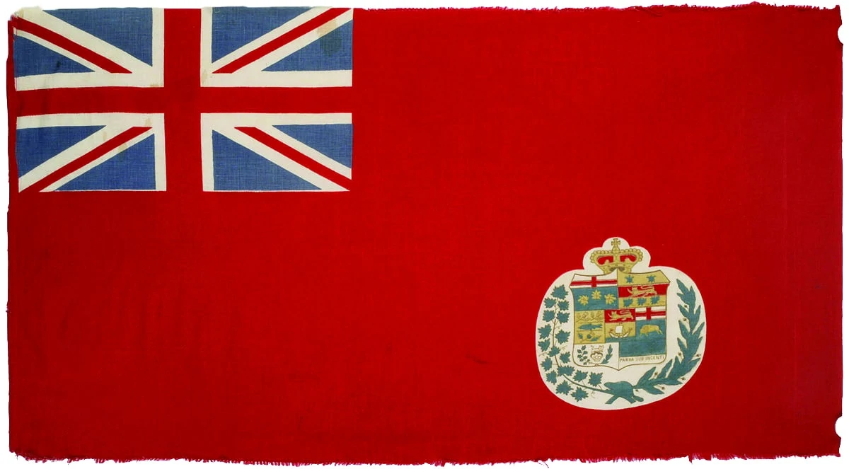
The British North America Act makes it official: Dominion of Canada, it is! Technically, the British Union Jack was the official flag of Canada at the time, but the “red ensign,” a red flag with the Union Jack in the top left corner, was flown more widely.
1885
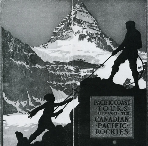
Banff National Park is established as Canada’s first national park, and is instrumental in advertising Canada to the rest of the world as a paradise of rugged mountains, soaring trees and pristine lakes.

1885–1914
The enterprising immigration minister Clifford Sifton advertises Canada in Europe as “The Last Best West,” a reference to the perception that all the good land in the US had already been settled. Of course, the Canadian Prairies had been “settled” for thousands of years by then, but we have a history of conveniently overlooking such facts.
1921
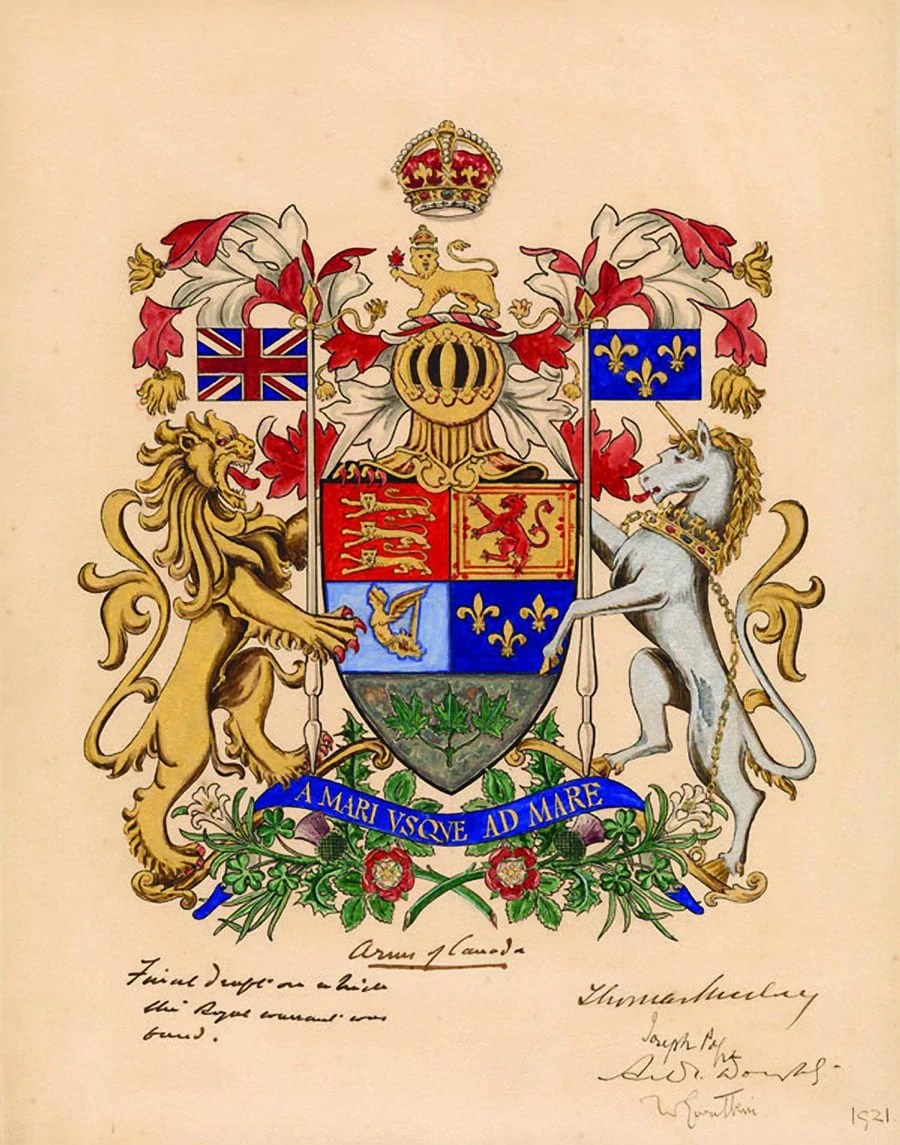
A royal proclamation establishes Canada’s coat of arms, as well as the country’s national colours: red and white.
1931
Tired of dealing with the colonies, the British government downloads a lot of powers and responsibilities to Canada via the Statute of Westminster, helping Canada begin to get out of the shadow of the British Empire.
1965
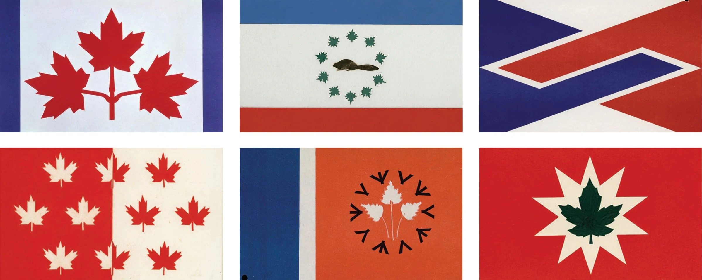
After much debate and a wide range of options, the National Flag of Canada—better known as the Maple Leaf—is adopted by the Canadian government. Prime Minister Lester B. Pearson had sought a new flag for Canada based on his experience brokering the end to the Suez Crisis, during which Egyptian negotiators took umbrage over Canadian peacekeepers sporting the Union Jack on their uniforms.
In addition to the new flag, the Canadian Government Travel Bureau adopts the “Canada” wordmark, designed by Toronto’s Jim Donoahue, to promote Canadian tourism abroad.
1967
Trudeaumania, Expo 67 and Canada’s 100th birthday mark Canada’s arrival to the world as not just a bunch of mountains, lakes and trees.
1970
Under the Federal Identity Program, the Canadian government makes Helvetica its official typeface due to its “versatility, excellent legibility and contemporary design.”
1980
An update of the tourism wordmark—using a modified Baskerville typeface with the Canadian flag over the last “a”—gets adopted government-wide as an official symbol. According to the Treasury Board Secretariat, “The objective of adopting the Canada wordmark was to have a unified federal identity that is applied consistently across all departments. This ensures that the public can easily recognize the Government of Canada and its programs, services, facilities, assets, activities and uniformed officials.” By now, you’ve probably seen it thousands of times on everything from tax returns to film credits.

1987–1993
Canada publishes its first-ever comprehensive manual of design standards, in a neat and tidy 16 volumes. Perfect for a light beach read!
2011
Stephen Harper’s Conservative government earns some derision for changing “The Government of Canada” to “the Harper government” on federal communications. On a potentially related note, the Government of Can—er, the “Harper government”—unveils millions in federal spending to mark the bicentennial of the War of 1812, and restores the “Royal” names and insignia to the branches of the armed forces.
2015
Ottawa designer Raymond Larabie releases a modified version of his “Mesmerize” typeface ahead of Canada’s 150th birthday, which is soon adopted by the federal government as the official font of Canada 150. To reflect a broader understanding of Canadian identity, Larabie designed the characters and glyphs needed to properly incorporate Indigenous languages such as Cree, Inuktitut and Anishinaabemowin.
